A guide to CSS Container Queries
A modern approach to repsonsive components
Edit (August 2022): Container queries are supported in Chrome and Safari !
For Firefox, there is a Polyfill (at the end of the post)
In CSS, we can use media-queries to adapt the layout based on the viewport size. It allows us to adapt the layout based on the screen size of the user.
We take it for granted but back in the days this was a life changer!
But we can still do better.
The use case
We think way more in terms of components nowadays, and we'd like components to behave based on the space they've been given, not the layout size.
Let's say we have a card that supports a narrow and a compact layout.
Wouldn't that be cool if CSS could switch this layout based on the parent width?
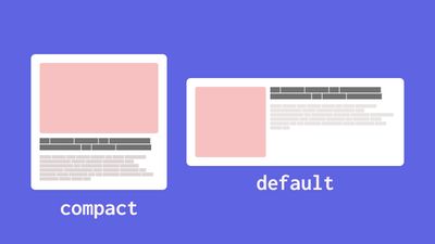
Two card components. One uses an horizontal layout and the other a vertical one.
Selecting the layout based on the viewport doesn't make a lot of sense here. What matter is how much room is available for the card, the container.
This opens the door to a lot of neat things! We can now let our component adapt their layout seamlessly.
The code
Container queries need the container to have a container-type property. It defines which query type we can use.
For example, to query the width, we'll put the following on the container:
.container {
  container-type: inline-size;
}
We can now use @container on our component:
@container (min-width: 600px) {
  .card {
    display: flex;
  }
}
And that is basically it, that simple.
Have a look at that demo:
See the Pen Unknown Pen on CodePen.
Firefox Support with Polyfill
Firefox is still widely used, especially by developers. We will implement this polyfill to our codebase to make it work, until Firefox supports it.
The implementation is pretty straightforward, add the following to your <head>:
<script>
  if (!("container" in document.documentElement.style)) {
    import("https://unpkg.com/container-query-polyfill@^0.2.0");
  }
</script>
And that will make container queries work on any browser!
This is everything needed to get started with container queries, congratulations 🥳
If you want to apply your fresh knowledge, a good challenge is to create a blog post component that can be used in the main list, in the sidebar and in the recommended post list.
I'm Tom Quinonero, I write about design systems and CSS, Follow me on twitter for more tips and resources 🤙