How To Finally Figuring-out the Font Size for Titles
A ratio based method to handle headings sizes in your designs
Using heading sizes based on the body maintains a visually appealing flow on your website. Instead of handpicking font sizes, we can take a base size and multiplicate it by a number - the size ratio - to obtain a bigger size, and so on. Every font size will scale when the main font size changes.
We now got harmonious sizes that look nice together 🤗
If you need to grab the code fast, I've made a codepen to demonstrate the use of ratio-based font sizes.
The size ratio should be a number between 1.1 and 1.7 .
Play with different ratio on type-scale.com to preview how different values look.
Let's set up your base font size and then use calc to compute the headings font-size attributes.
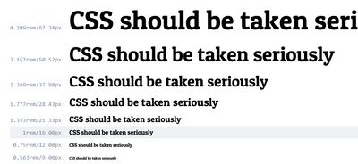
Ratio based font sizes. Screenshot from Type Scale.
The base font size and the 10px trick
The font size on your root element (usually the <html>element) will define what 1rem is. Let's use 10px as a font-size for the root element. Then it becomes easy to convert px in rem.
A body size should at least be 16px so let's declare that on body
html {
  font-size: 10px;
}
body {
  font-size: 1.6rem; /* 16px */
}
About responsiveness, If you need to bump the size of the font for larger screen, you can just change --size-500 and the other will follow. Smarter could be to change the html font-size, so every margin and icon size using rem defined size will scale too.
Using calc() to compute bigger and smaller sizes
Instead of setting headings font-size, variables are assigned, so they can be used for other purposes. Using those variables for your font-size, will enforce consistent font sizing.
These variables goes from --size-300 to --size-900.
--size-400 is the base and the other are computed using the --font-ratio variable.
The ratio can be changed to give a different amplitude to your design, but we'll default to 1.33
The size ratio can be changed by only overwriting the --font-ratio variable. You can do that in your browser too, using the dev tools 🤯
:root {
  --font-ratio: 1.33;
  --size-300: calc(var(--size-400) / var(--font-ratio));
  --size-400: 1.6rem; /* 16px */
  --size-500: calc(var(--size-400) * var(--font-ratio));
  --size-600: calc(var(--size-500) * var(--font-ratio));
  --size-700: calc(var(--size-600) * var(--font-ratio));
  --size-800: calc(var(--size-700) * var(--font-ratio));
  --size-900: calc(var(--size-800) * var(--font-ratio));
}
Now we have useful CSS variables that we can use to stylize our titles. but you can also use them for any custom CSS you'll do in the future.
These sizes values can be used for headings size, but also for any other element.
A use case would be making larger version of a button. For example, the size will be --size-500 instead of --size-400.
Stylize headings using the ratio-based sizes
Let's define a body size to --size-400 , the label size to --size-300 and the titles to some bigger sizes. It depends on how deep you need to go with your hierarchy. I usually am fine with h1 to h3 only but this might not be your case:
p {
  font-size: var(--size-400);
}

label {
  font-size: var(--size-300);
}

h1 {
  font-size: var(--size-700);
}

h2 {
  font-size: var(--size-600);
}

h3 {
  font-size: var(--size-500);
}
Conclusion
If you followed along, you now are ready to set up your own ratio base font size system. Yay!
Setting how much 1rem is and setting the body font size should be your first step. You can now compute a set of sizes, using a ratio. Finally, use these and only these in your CSS!
See the Pen Unknown Pen on CodePen.
You are now all set!
Congrats 🥳🎉
I write about design systems and CSS, follow me on twitter for more tips and resources 🤙