Native HTML Modals with the Dialog Tag
A convenient and accessible approach to Modal windows
In 2019, major browser vendors teamed up to fix major compatibility issues, and improve the overall developer experience on every browser.
The consistent implementation of <dialog> was part of their 2022 effort, named Interop 2022.
Dialog allows us to make modal windows in native HTML. Isn’t that great?
We can also use it for any other dialog, kind of like an elegant alert.
And thanks to Interop 2022, that element is widely supported, so we can implement it, like right now!
The Problem with Homemade Dialog
A few years ago, my team and I had an issue with our modal component. It did not work properly inside a container that had an overflow: hidden.
It was because the modal was living inside that container, so it could not be seen outside it. After all, that is what overflow: hidden is supposed to do!
It was a pretty nasty issue: we needed the modal to be someplace else in the DOM for it to work.
We were using VueJS, so we used the Portal method.
Another issue is that sometimes another element can have a greater z-index value and, thus, being displayed on top of the modal.
On top of that, another bump in the road was that in case of nested modals, pressing the Esc key would close them all. The fix was not fast nor simple to implement.
All these issues made a simple layout need, overcomplicated.
And that is why we should care about the dialog element!
HTML Standards to the Rescue
Dialog shows up in the front of everything, no mater what. It doesn’t matter if it’s inside an overflow:hidden element, it’ll show. The Esc key support is native and close only the current modal.
Also, it displays a (customizable) backdrop behind it.
All our problems goes away!
We do require JavaScript to open it, by using the showModal method on the element.
When using showModal it will show the modal, and focus on it. Tapping the Esc key will close it.
And of course, we can imbricate as many modals as we want.
Implementing a Dialog
We don’t need to write a lot of code for this to work.
First we need our modal and the button that opens it in our HTML:
<button class="openModal" data-modal="modal-1">Open Modal</button>
<dialog id="modal-1">
  <h2>Modal Title</h2>
  <p>
    Pellentesque id tempor justo. Nunc vel purus tortor. Maecenas quis sapien
    quis odio pulvinar efficitur vitae quis massa. Ut et consequat felis.
    Pellentesque tortor quam.
  </p>
  <p></p
></dialog>
Now we’ll write a JS function that listen click events on buttons with a openModal class. When clicked, it will use the data-modal as an ID to target the modal.
The benefit to this approach is that you can use as many modals as you want without touching your JS again!
const buttons = document.querySelectorAll('.openModal')

buttons.forEach((button) => {
  button.addEventListener('click', (event) => {
    const modal = document.querySelector(`#${event.target.dataset.modal}`)
    modal.showModal()
  })
})
That’s it, we now have a functioning modal system in native HTML!
But it doesn’t look quite alright, does it?
Styling the <dialog> element
The <dialog> element behave like any other element, so nothing particular there.
For the backdrop, we use the ::backdrop pseudo-element:
dialog {
  border-radius: 0.4rem;
  padding: 0.8rem;
  border: none;
}

dialog::backdrop {
  background-color: rgba(0, 0, 0, 0.4);
}
That’s it for the style, let’s add a close button now!
Adding a Close Button
We can close the modal using the close function. Let’s add our close button:
<button class="openModal" data-modal="modal-1">Open Modal</button>
<dialog id="modal-1">
  <button class="closeModal">Close</button>
  <h2>Modal Title</h2>
  <p>
    Pellentesque id tempor justo. Nunc vel purus tortor. Maecenas quis sapien
    quis odio pulvinar efficitur vitae quis massa. Ut et consequat felis.
    Pellentesque tortor quam.
  </p>
  <p></p
></dialog>
Now let’s listen to click events on these buttons, find the nearest dialog parent, and closing it:
const closeButtons = document.querySelectorAll('.closeModal')

closeButtons.forEach((button) => {
  button.addEventListener('click', (event) => {
    const modal = event.target.closest('dialog')
    modal.close()
  })
})
Simple CSS for positioning the button:
dialog {
  position: relative;
}

.closeModal {
  border: none;
  background: transparent;
  padding: 0.4rem;
  position: absolute;
  top: 0;
  right: 0.8rem;
  cursor: pointer;
}
And we are done!
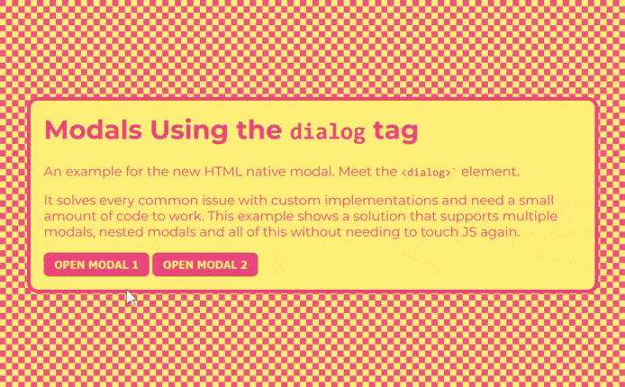
You can check out the CodePen demo I made, that showcases nested modals with some additional styles:
See the Pen Unknown Pen on CodePen.
And we are done for today.
I hope you are as exited as I am about this new CSS feature!
I'm Tom Quinonero, I write about design systems and CSS, Follow me on twitter for more tips and resources 🤙